
Table of Contents
Reporting and analytics dashboards are visual tools that pull together safety, compliance, quality, and operational data, such as incidents, inspection findings, and corrective actions, into charts, trends, and key performance indicators that are easy to scan at a glance. They matter in the workplace because raw data sitting in spreadsheets or scattered reports rarely gets reviewed or acted on, while a well-built dashboard makes patterns and risks visible immediately, helping teams make faster, better-informed decisions instead of discovering problems only after they’ve already caused harm.
What Are Reporting and Analytics Dashboards?
A reporting and analytics dashboard consolidates data from multiple sources, such as incident reports, inspection results, training records, and audit findings, into a single visual interface. Instead of manually pulling numbers from separate systems and building a report by hand, a dashboard updates automatically as new data comes in, showing current status and historical trends side by side.
Dashboards typically range from high-level executive views, showing overall safety performance across an entire organization, down to site-specific or team-specific views that a local manager can use to track what’s happening in their own area day to day. Good dashboards are built around a small number of meaningful metrics rather than overwhelming users with every data point available.
Why Reporting and Analytics Dashboards Are Important in the Workplace
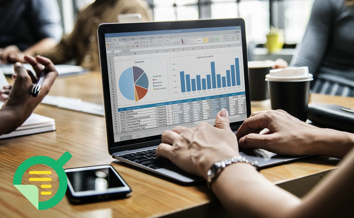
They Turn Raw Data Into Actionable Insight
Data on its own doesn’t prevent incidents; decisions based on that data do. A dashboard that clearly shows which location has the highest rate of overdue corrective actions, or which hazard type keeps recurring, turns a pile of individual reports into something a manager can actually act on.
They Enable Faster, More Informed Decisions
Without a dashboard, spotting a negative trend often requires someone to manually compile and compare data over time, which delays the response. A live dashboard surfaces a spike in incidents or a growing backlog of overdue actions immediately, so leadership can respond while it’s still a small problem.
They Improve Accountability Across Sites and Teams
When performance data for every location or team is visible in one place, it becomes much harder for underperformance to go unnoticed. Dashboards create a shared, objective view of performance that doesn’t rely on self-reported summaries from each site.
They Support Better Reporting to Leadership and Regulators
Executives and boards increasingly expect clear, data-backed safety and compliance reporting, not anecdotal updates. A dashboard makes it far easier to produce accurate, consistent reporting for leadership reviews, board meetings, and in some cases, regulatory submissions.
Key Components of an Effective Reporting Dashboard
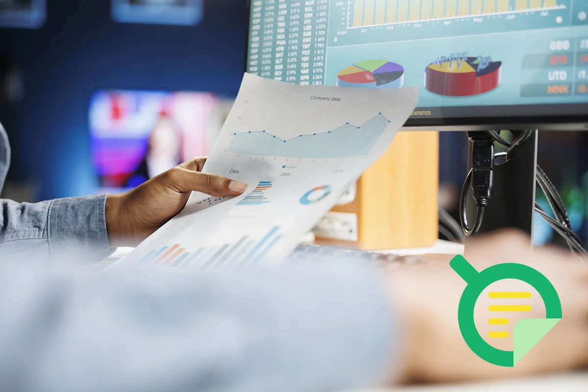
Real-time or near-real-time data. Pulling directly from the systems where inspections, incidents, and corrective actions are logged, so the dashboard reflects current reality rather than a stale snapshot from weeks earlier.
A focused set of key metrics. Highlighting a handful of meaningful indicators, such as incident rate, overdue corrective actions, and inspection completion rate, rather than burying users in every possible data point.
Drill-down capability. Allowing a user to click from a high-level trend into the underlying individual records, so a spike on a chart can actually be investigated rather than just observed.
Role-based views. Showing site managers the data relevant to their location and showing executives an aggregated, organization-wide view, rather than forcing everyone to look at the same undifferentiated report.
Trend tracking over time. Displaying historical data alongside current figures, since a single data point rarely means as much as a trend line showing whether things are improving or getting worse.
Best Practices for Reporting and Analytics Dashboards
Organizations that get real value from dashboards keep them focused on a small number of metrics that actually drive decisions, rather than trying to display everything available and overwhelming the people who need to act on it. They make sure the underlying data is accurate and current, since a dashboard is only as trustworthy as the data feeding it. They review dashboards on a regular cadence as part of actual management routines, such as a weekly safety meeting, rather than building them and letting them go unused. And they give different audiences different views, so a frontline supervisor sees the operational detail they need while an executive sees the summary trend that matters at their level.
Frequently Asked Questions
What’s the difference between a report and a dashboard?
A report is typically a static summary of data for a specific period, often generated manually or on a schedule. A dashboard is a live, interactive view of current and historical data that updates automatically and usually allows users to explore the underlying details rather than just reading a fixed summary.
What metrics should a safety dashboard include?
Common metrics include incident and near-miss rates, overdue corrective actions, inspection and audit completion rates, training and certification compliance, and trends broken down by location or department. The right mix depends on what an organization is actually trying to manage and improve.
Who typically uses reporting and analytics dashboards in a workplace?
Usage spans multiple levels, from frontline supervisors monitoring their own site’s day-to-day performance, to safety and compliance managers tracking trends across locations, to executives and boards reviewing high-level organizational performance during regular business reviews.

Browse Our EHS Resources